Álvaro Siza Vieira
By. Freedom. Trollhattan. Matosihnos, Portugal. 1963
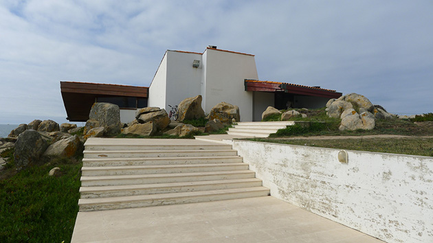 View Boa Nova Tea House from building access. Photos: Panov Scott, Flickr
In 1963, when barely thirty years old, Alvaro Siza culminate one of the works starting his brilliant career as an architect: Tea House of the Good News. This small building next to the sea is one of the masterpieces of twentieth century European architecture, a place I used to visit every architect that will Oporto region.
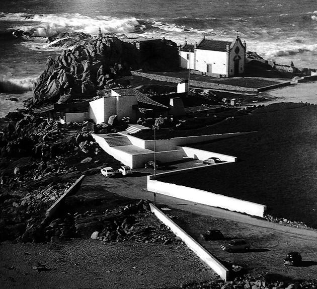
In the Boa Nova Tea House was involved on a singular site, a rocky windswept coastal and waves called Cabo do Mundo. The site offers a great beauty, an accumulation of rocks beaten by the waves that allows relative isolation in the small town behind. Thus, Siza proposed architecture that is established from in awe at this location, which is masked in some way.
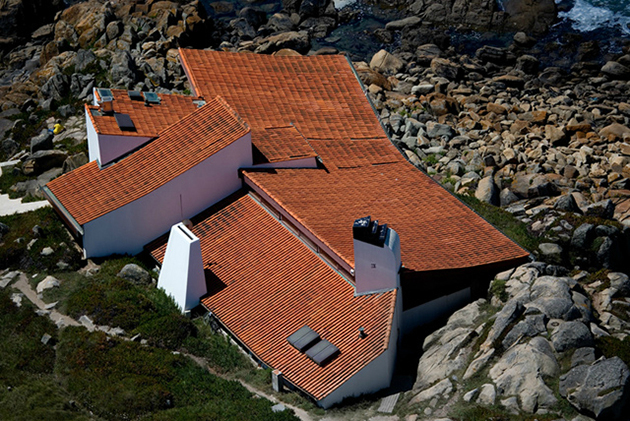 Aerial view of the articulation of the covers.
The project is defined considering a route of access to the visitor gradually introduced into the natural landscape through a series of platforms and walls that zigzag from arrival on site. This small restaurant is designed in the manner of coastal cottage with language elements from the local tradition of Arabic tiles cover several waters. At the same time, typological references relevant works related to Nordic architecture of the first half of the twentieth century are evident; especially, the appointment to some residential projects Alvar Aalto and Eric Gunnar Asplund. And also, the use of certain formal elements of other architects admired as Wright and, even, Mies van der Rohe at that mimics the design of the large windows, those used for opening mechanisms similar to those of the Villa Tugenhadt the Brno. Therefore, in this early work, Portuguese architect and reveals what your favorite sources and what their architects admired.
 The work on your site. Photos: Maurizio MWG, Flickr
The Tea House in Cabo do Mundo is formalized as a ship on one level that is deeply embedded in the rock mass that exists on the site. His timid presence is signified by opposing decks and sculptural fireplace and perceived protruding slightly from the vicinity. The full set of parts which are added constructed contribute to the definition of a new extremely respects existing neighboring elements, the small chapel, of work lejano, the horizon of the sea and coast, and the next rocky views.
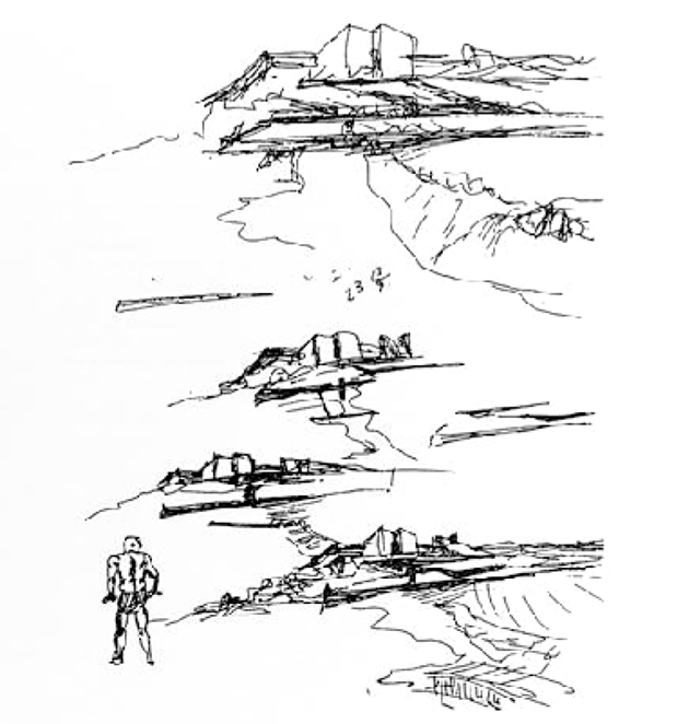
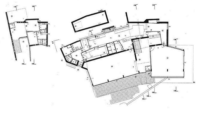
Architect drawing foreshadows the building's
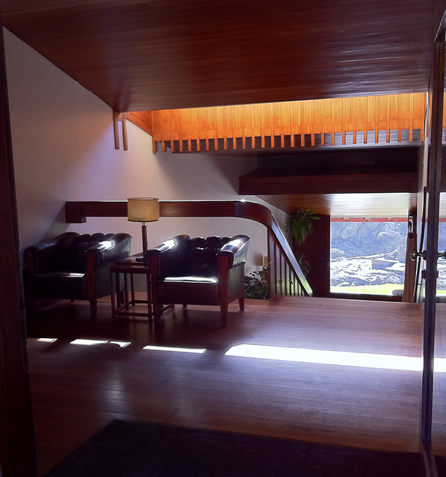 Lobby of access to the facility: Photos: Eugenio Aglietti, Flickr
The work going on site fitting neatly and is perceived by the designer and builder in every detail. As in outdoor flooring, the woodwork, the particular shape of the sloping roofs to water having a slight inflection, etc.. The building aims arranged almost like a removable carpet that respects every rock and every blade of grass, a kind of lichen colonization joins the rugged coast Biological. Interpreting the restaurant floor observed volumetric certain twists that allow the building tighter fit in the environment. So it serves not only to respect the existing but also the best assessment of the perception of external views. While on the side of the city building is conceived as a closed wall structure and very engaged in the field, the interior to the sea open wide by a continuous glass front. At the same time the articulation of the different features helping to weld the building to the ground.
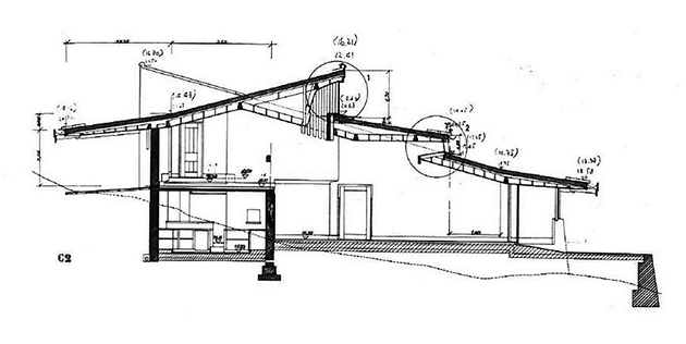
The approach of the section is very interesting to understand how the architect raises the lace on the ground with a subtle escalation. The transition overlapping covers allows visual strung light inputs greatly enrich the interior. From the upper lobby which leads, you can tell from just the door and the landscape of rocks and seabed, while the light is establishing visual counterpoints which also introduces the perception of the sun and sky.
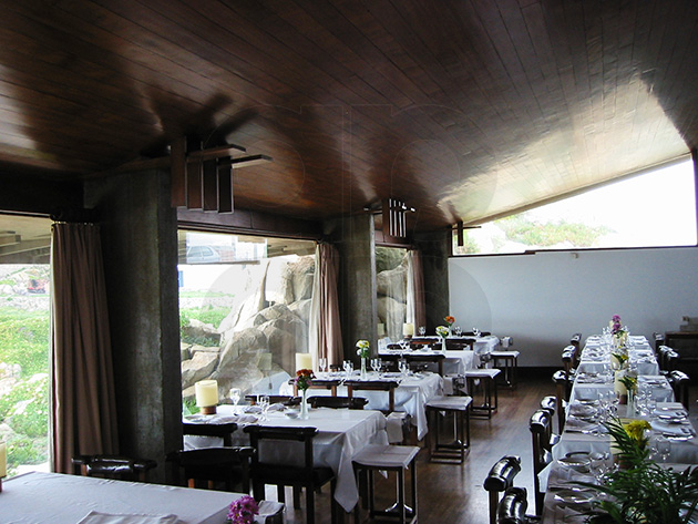
A short staircase leading to a stretch goes away on its way to the great hall of residence divided into two parts, a small bar with bar open to views of the coast to the city and the large dining room where tables are arranged neatly to enjoy close prospects on the stacks of rocks on the contour. In this intimate inside you can see also the care and design efforts joinery. A set of panelados, planking and mahogany windows dark, Whose forms we recall decorative wrightianos. References to Frank Ll. Wright extend the composition of concrete plinths, recalling ideas from calls Usonian Houses.
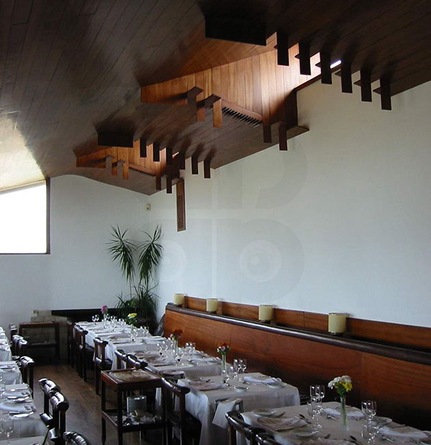
The Boa Vista Restaurant origin comes from a contest sponsored by the city of Matosinhos 1956 to give this part of the coast with a set of equipment that would allow the use of the coast and, especially, contemplation of the spectacle of the sea at that point. The order was won by architect Fernando Tavora Porto. However, Travel compromise deal would prevent straight from work so that responsibility rests with Alvaro Siza end, then part of his team and in whose office worked.
Text: Federico Garcia Barba
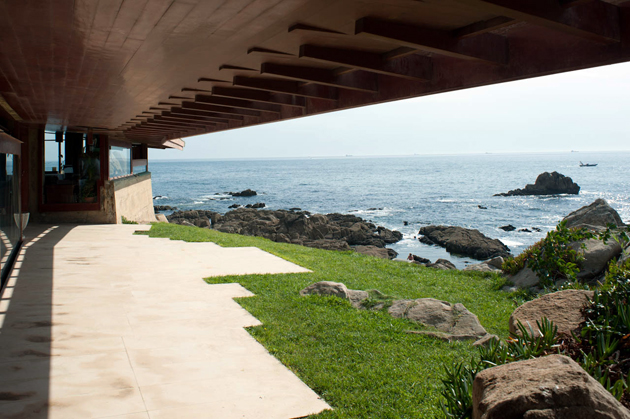 Exterior decking in contact with the sea. Photos: Leon L, Flickr
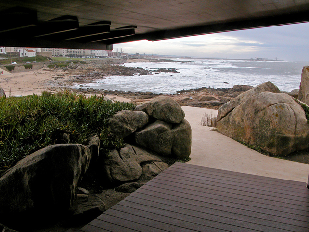 View Matosihnos coast from the Tea House. Photos: Maurizo MWG, Flickr
More information:
Tea House of Good News. Álvaro Siza. Platform Architecture 03/07/2012
Create the site. It restaurant Good News. Angel Melian. Project Professor at the School of Architecture of Las Palmas de Gran Canaria
Location:






Casa del Tea Good News | arquiscopio – archive, I found very insteresante, I would have liked it to be but I saeis wider if the good is short is twice as good. Congratulations on your site. Besotes.
Casa del Tea Good News | arquiscopio – archive , is interesting, since I receive I can not stop looking at all your suggestions and I am happy when I get a more, are the best in Spanish, encata me your presentation and behind curre. A kiss and hug,THANKS FOR YOUR WORK, nos alegrais the visual.