|
Plan Uses and Road System of the overall management, belonging to the Revised 1995 by the City of Irvine
IRVINE RANCH PLAN
William Pereira & Ass. Are yJohn
Orange County. Los Angeles, California. 1962
Irvine is an enormous expanse of ground, more than 400 km2, located south of the coast of Los Angeles, that forms the heart of Orange County and would emerge around the campus of the same name. Its urban planning is an essential element of the history of recent territorial planning in the United States.
This urban conglomerate occur from the gradual transformation of a former cattle ranch. The first urban ideas are born in the mid-twentieth century the choice of where to site a new university and have a first expression in the formalization of a campus centric radius around a large open space, Aldrich called Park.
In the fifty years to the original Irvine University have been adding new pieces to form a conglomerate urbanization urban, inhabited by more than two hundred thousand people and containing numerous services, economic activities and, even an international airport, el John Wayne Airport. This has been a gradual process of territorial planning, led by the Irvine Company has scheduled so indelibly the typical Californian contemporary territory arrange private transport around the car.
References:
History of the Irvine Ranch planning. Irvine Company. Good planning. org
Updated planning document page. City of Irvine
Aerial perspective of the coastal Orange County, including numerous low-density residential developments, mixed-use area and mall Fashion Island and Newport Beach in the background.
The main part of the village with wooden screen that defines the dining space
Villa Tugendhat
Mies van der Rohe
Cerna Pole. Brno, Czech Republic. 1928
This house
Here the architect deploy relevant spatial ideas, The autonomous provision of structural supports, the transparent enclosure that integrates the exterior landscape and the rigorous application of a frame lattice for fitting the dividers. The effort complements the furniture created with the help of Lily Reich, the choice of luxurious materials for the finishing and coatings, such as Atlas veined marble, onyx, stainless steel, Ebony wood, etc.. Resources that contribute significantly to the overall qualification.
Photography: Maciej Warich, Picasa References: Original drawings of plants
ACCESS FLOOR
FLOOR Aerial view of the complex
RESIDENTIAL ROMEO AND JULIET
Hans Scharoun This project is the first building designed by Hans Scharoun in German postwar, where he puts all his conclusions practices acquired over many years. This residential complex located in the eastward expansion of Zuffenhausen, in a small village next to Stuttgart,, wherein the ratio of the built with the immediate surroundings is given by the combination of two opposite typologies: the vertical tower and linear building gallery
With a total of 186 property consists of two buildings located at the corner Romeo this, in two important pathways that converge where is imposed by its verticality, occupying a small percentage of the total area. Juliet on the other hand is located in arguably the most private place in the field, occupies more area because of its semicircular shape and therefore generates a private garden, a second space transition, where children can play inside .
References:
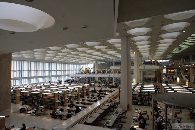
Interior View of the Library
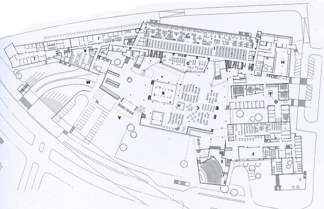
State Library of Berlin
Hans Scharoun
Berlin.Alemania.1967-1978
Exterior view of the house
CASA SCHMINKE
Hans Scharoun
Kirschallee. Lobau. Germany,1930-1933 The Schminke House is an outstanding example of the "International Style". Sharoun as apparent moderna.donde architecture applies many of the concepts of art of the time.
This detached house built between 1030-1933 Schminke Löbauer the manufacturer was occupied by a marriage and four children. The building is elongated parallel to the street where the axle housing is highlighted by a large overhang with external stairs and portholes evoking elements used on ships. The house has two floors life unfolding on the ground floor, being the highest amplitude, on the first floor are the bedrooms being these very simple and spartan. The steel structure is generating a well formed nautical architecture style of the building.
References:
Tower View from the Garden White Castle. Photos: Holler&Saunders
CASTLE GARDENS SISSINGHURST
Vita Sackville-West y Harold Nicolson
Cranbrook. Kent, England. 1930
Fragment of overall development level of urbanization. British Library
HAMPSTEAD GARDEN SUBURB
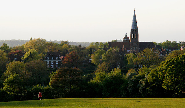
View from Hampstead Garden Suburb Heath. Foto Sabine Thoele, Flickr
General management plan of the layout of the new town
CAPITAL PLAN FOR AUSTRALIA The Marion Walter Burley Griffin
Canberra, Australia. 1913
In the early twentieth century Australian authorities decide the search for a suitable place for the foundation of the capital city of that country continent. In 1908 ideal space would select as a plain slightly undulating containing gaps Molongo served by the River, surrounded by some hills and mountains.
In 1911 convocaría is an international competition of ideas that receive 137 proposals, from that presented by the Illinois American couple formed by Marion and Walter Burley Griffin would get first prize with a sense of urban structure radiocentric, composed of several focal points interconnected by wide avenues. At its center, the main point was used for the seat of the national parliament and government. The sub articulate several residential and production sections. The whole arrangement is in a lagoon engarzaría formalized as two large ornamental ponds circles connected.
The Griffin Canberra Plan is the culmination of the ideas of the City Beautiful movement emerged in Chicago, around
References: Ideas and plan elaborate schemes to Canberra.
Source: Ideal City. National Archives of Australia
Documentation and Description of contest held. National Archives of Australia
Page dedicated to Walter Burley Griffin. Wikipedia
Perspective from the central axis of the proposed city. Marion Griffin
Exterior View of Housing
CASA OKITU
Pete Bossley.
Tatapouri Point. NZ. 2004
Situated on a hill north of Gisbore this open and spacious family home enjoys a spectacular view of the bay of Tatapouri. Stands for simplicity in both inner and outer, where for all points the sea is present.
With a comprehensive program as it had to accommodate a large family decided to give T-shape with a metal supporting structure holding the light cover, giving the house a highly transparent and structural lightness.
References:
Harry Seidler
Sidney.Australia.1951
This Austrian architect llege in Australia 1948 and designed this house for his own family. Open spaces is proposed, geometric lines, minimalist color and unusual construction that would be worth the surprise and even rejection of Australians, where this combination of materials was completely new at the time. A spacious and a desire maximum spatial interaction resulted inside the townhouse, where living and sleeping areas are separated, joined by a small living room, you can join rooms, or part of the living room which is separated only by a curtain dividing.
Harry Seidler is one of the architects who most influenced modern Australian architecture, which built his prolific work has changed the profile of many cities that hosted.
Photography: Secretdesignstudio
References:
Axonometria:
|
||
|
Copyright © 2026 arquiscopio – archive - All Rights Reserved Powered by WordPress & Atahualpa 73 queries. 1.242 seconds. |
||


